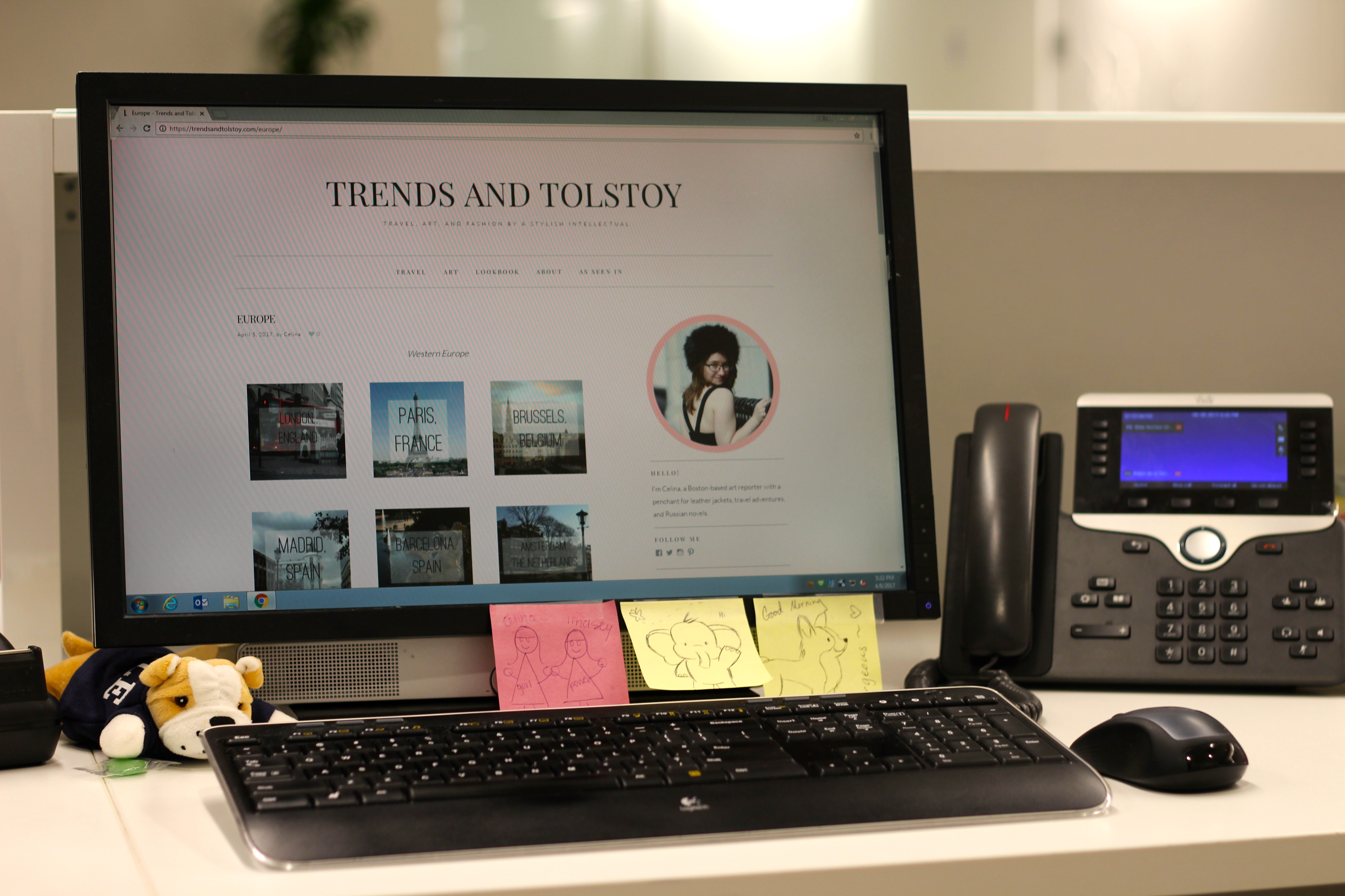
Things are looking at bit different around Trends & Tolstoy these days! After celebrating my six year anniversary I realized I haven’t given the site a facelift since 2012. It was time for a spruce. I wanted my online space to encapsulate the changes my brand has experienced over the past few years. The focus has shifted from just fashion to travel and art as well. This more sophisticated design provides space for all my interests.

What’s New
Aside from the aesthetic updates, you’ll notice three distinctive pages on the top menu bar. Under the “Travel” section you can find links to my local and international travel guides and posts. Under “Art” you’ll find my reviews of visual art, performance, activist art, and multimedia projects. “Lookbook” has the classic outfit photos I’ve always featured.
Why Now?
Aside from the embarrassingly long time it’s been since I updated the site, I’m working on a project that necessitates a new look. In March I embarked on the first of a year-long itinerary of art-centric trips. During this 12-month stint I’ll be discovering the hidden art hot spots in a series of domestic and international locations. After two years of staying still to secure a new apartment and a new job, it feels great to be adventuring again. Stay tuned on Trends and Tolstoy for coverage of my travels. You can also find journalist reviews of the art I’m seeing in The Bay State Banner.
To follow along every step of the way, check out my social accounts: Instagram, Twitter, and Facebook.